French Country Living
Feature
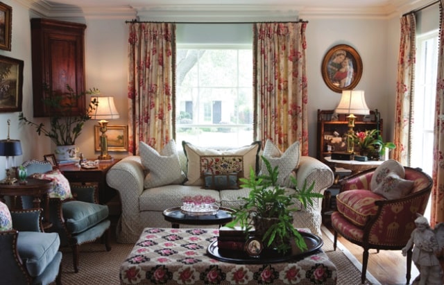

Carolyn Westbrook is a designer known for her love of French interiors and in her book Through the French Door, she shares her romance with beautiful and inspiring interiors, and invites us into some beautiful homes, including her own. Photography by Keith Scott Morgan.
French country living, as exemplified here, is all about relaxing in time-worn comfort. Everything in the room has been very carefully chosen, which takes years of collecting the right ingredients. Beautiful pieces of furniture in the living area have been arranged in a way that is inviting and comfortable. There is no hint of pretension or stuffiness, which is what I love about this style of decoration.
On entering the room, you simply want to head straight for the couch and plop yourself down, to be enveloped by the down-filled pillows. If the couch is already taken, there is plenty of alternative seating to be had. The windows, too, are welcoming, dressed up with elegant drapes in warm neutral hues, while the lighting, soft and balanced, has been designed to perfection.
The French country living style prevails in the living room, where an inviting fireplace anchors the space and beckons all to gather. The soaring ceilings expand the size of the room, but it remains cozy with all the interesting and comfortable surroundings. Lighting sets the tone of any room. Overhead lighting alone makes a room appear cold and uninviting. Atmosphere and warmth are created here through pretty table lamps in a range of sizes, scattered around the room – the prettier they are, the better.
With my layered style of living, the throw or eiderdown is ever present. It not only brings in more pattern and texture, but softens a room when thrown over a couch or chair, creating a partnership of comfort and beauty.
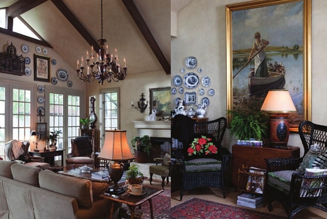
In my last book, The French Inspired Home, I had a chapter focusing on French bleu. Blue is dramatic and can be portrayed in so many variations from cobalt blue to the palest French blue that is reminiscent of the Asiatic pheasant transferware that I collect. I seem to be attracted to them all.
A marvellous blue antique sink has been reborn into a little hallway powder room and placing it inside a marble-topped washstand turns an ordinary room into one that demands a second look. Meanwhile, in the dining room, my treasured collection of blue transferware forms part of a delightful blue and oatmeal collage with a pine buffet. The buffet had been waiting in our barn for 12 years for a place in our home. I have always loved pine and it suddenly struck me that it would look wonderful here and also provide much needed storage. The arched doors make it a striking piece, and its rich, warm colour shows off the transferware to perfection. It goes to show that if you have a piece that you love, never let it go. Take a step back and think about where it would work best in your home. This single piece has given a whole new look to a room badly in need of redecoration. It made me wonder why I hadn’t done it before but even designers become complacent about refreshing their homes. The bedroom here is simply and quietly gorgeous. The mahogany dresser grounds the room, while the blue print drapes add a sense of drama, at the same time softening the dark wood elements. A wonderful antique “puff” beckons one to snuggle up and have a contented nap.
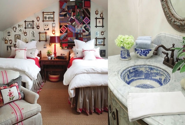
One bedroom reminds one of coming home. It has a French country appeal with French ticking and red accents that make for a charming room. A chair is upholstered in antique French fabrics with the red embroidered laundry monograms. I learned while in France that the initials that are found on antique French textiles actually are to identify items when sent to the laundry – another great detail to be cherished and displayed years later.
A great display of how to decorate a wall becomes evident here, and the focal point is a family antique crazy quilt. This collage is carefully composed of antique antlers and ancestor photos that have been arranged to perfection. Red accents are reflected in the lamps, baskets, and bedding. This room celebrates my love of layering and remembering my motto, more is more.
Just off the kitchen is a gracious eating area, neutral in palette and big on style. This is the epitome of the French Country look, where elegance sits side by side with rustic simplicity. As always, the detailing is crucial to the success of the decoration, from the tiny buttons running along the curtain panels to the tufting on the linen-covered dining chairs.
The room is awash in the faded patina that is most appealing to the eye. A wooden bowl of antlers makes for an interesting and textural arrangement on the pine cabinet. Behind the glass doors is more of my favoured transferware, their deep blue making an eye-catching contrast with the wood. A tin bucket serves as a vase of sorts, for bunches of kale and hydrangeas that are picked from the bushes just outside. Overseeing it all is a beautiful antique chandelier hanging above the table. A pair of wall sconces in the same style add to the allure created by the twinkling light.
Antique pieces of furniture, such as shelving, are used to house cooking essentials, from nuts and oatmeal to sugar and fl our, stored and celebrated in
vintage glass containers. Glass spooners are filled with silverware and grouped together for convenience. Stacked high and topped with forks, plates become part of the tabletop décor, while napkins are rolled and housed in a tall pedestal-type glass. Fresh herbs play a starring role, pretty and easily accessed for cooking, tucked into an antique ironstone creamer. Cheeses, croissants, and desserts are stored on pretty and mismatching glass and china cake plates of all sizes, then covered by glass domes and cloches originally intended for covering seedlings in the garden. This is a world of necessities that has been worked into a beautiful and functional display. When designing a room, I am always drawn to an eclectic look and style.
The layering of exquisite pieces is the key to the success of these displays. The homeowner is a master at creating artwork collections, combining and cultivating them to perfection.
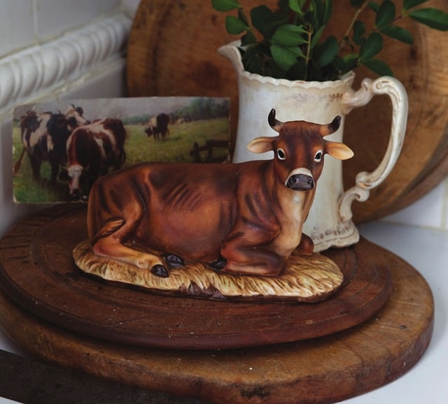
When designing a room, I always recommend going for an eclectic look – too much of any one thing is simply overwhelming. As you learn to mix and combine different elements that catch your eye, you become much like an artist yourself. I’ve been known to introduce Asian elements, even leopard prints, to my overriding French look. I love taking a bit of this and a bit of that, then combining them for a wonderful and intriguing result. My style is definitely not about having everything matching or symmetrical either – different shapes, sizes, heights, and styles are always a good idea, as is having odd numbers of things.
Bedding is of great importance to any sleeping area, and bedding is what I am known for. The Carolyn Westbrook Home white linen sheets, pillow slips, and duvet covers on these fabulous matching twin poster beds suit the room to a tee. It is important to have both masculine and feminine elements in a room, and balance them according to the look you want. This room is predominantly masculine in style, but the dark wood of the furniture, which grounds the room, is lightened, brightened, and enhanced by the stark white linen bedding. All of my essential decorative elements can be found here, creating the ultimate sleeping quarters.
Originally published in FrenchEntrée Magazine
Share to: Facebook Twitter LinkedIn Email
By FrenchEntrée
Leave a reply
Your email address will not be published. Required fields are marked *


